Brand Identity Design Hobart
Hobart's Brand Identity
Design Agency
Identity systems built for a small, tight-knit market where reputation travels fast and a considered brand stands out against the MONA-driven visitor economy.
- 100% five-star reviews on Trustpilot & Google
- No lock-in contracts
- 90-day performance guarantee
Trusted by industry leaders across Australia

















The short answer
A Hobart brand identity system is the structural visual language — spanning logo architecture, a heritage-sympathetic colour palette, and technical typography — that ensures a distillery, aquaculture firm or building contractor remains recognisable across every physical and digital touchpoint. For local producers, this means ensuring a cider label, a waterfront shopfront, and a vessel's livery all share the same DNA without requiring constant design intervention. We quantify the impact by auditing branded search impressions within Search Console and monitoring direct traffic shifts in GA4 alongside lead quality improvements, with all performance benchmarks defined in writing at kickoff.
Talk to us about brand identity design in Hobart
KPIs in writing · 90-day KPI guarantee · no lock-in
As Seen In






Hobart's commercial identity is built out of small, visible businesses: distilleries and wineries with cellar doors, seafood and aquaculture producers who sell wholesale and direct, Salamanca and Farm Gate market stallholders, hospitality operators competing for the same visitor season, and a construction and trades sector servicing a city that is still building. Add a compact professional services market — accountants, lawyers, health clinics — and the common thread is that most Hobart businesses are judged in person, at a stall, on a shelf or on a shopfront, as much as online.
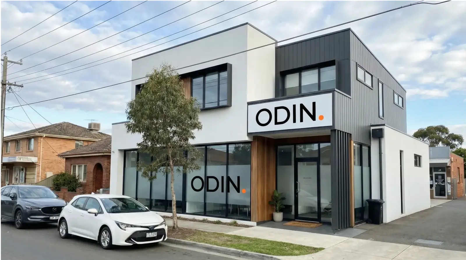
Odin Digital designs brand identity systems for Hobart businesses that need to look consistent across a label, a cellar door, a market marquee and a website — not just a logo that looks fine in isolation. That includes producers preparing to sell into mainland retail or export markets, hospitality groups opening a second site, and trades and professional firms whose paperwork and signage still reflect an earlier, smaller version of the business.
This is identity design specifically — the visual system. It differs from brand strategy and positioning, which decides who you're for before any of this is drawn, and from rebranding, which is the fuller process when the position itself needs to change.
- 90 Days
- Performance guarantee or we work for free
- 100%
- Five-star reviews on Trustpilot & Google
- 4.7X
- Avg. Client ROAS
- 0
- Lock-in contracts, ever
Hobart's Best Businesses Often Look Smaller Than They Are.
The recurring pattern here is a brand built for a stall table or a single cellar door that now has to work on a supermarket shelf, a wholesale order form and a website at the same time. A label designed to be hand-finished for a market run doesn't always survive a print run of several thousand, and a logo that looks warm on a chalkboard can lose all its detail reduced to a bottle neck or a favicon.
Tourism and hospitality operators face a related problem: the visitor season compresses a year's worth of first impressions into a few months, and a shopfront, menu and Google Business Profile that don't match cost bookings before a guest ever asks a question.
For trades, health clinics and professional firms, the issue is usually paperwork and vehicles that no longer match the website — a logo redrawn slightly differently on a ute, an invoice and a sign, so the business reads as three different operators to anyone comparing quotes.
The Cost of an Identity That Doesn't Scale With You.
Identity design in Hobart
Hobart's economy runs on businesses that present physically as much as digitally. Tourism and hospitality operators around the waterfront, Salamanca and North Hobart compete for visitor attention through shopfronts, menus and signage as much as through search. Food, beverage and aquaculture producers — distillers, winemakers, cheesemakers, oyster and salmon producers — sell through cellar doors, market stalls and wholesale accounts, often with the same label needing to work at a Farm Gate Market table and on a Hobart Airport shelf.
Arts and events businesses, from small galleries to festival-adjacent operators, need identity systems that photograph well and hold up across posters, programs and social content produced quickly and by multiple hands. Construction and trades businesses servicing Hobart's residential and commercial building activity are commissioning identity work when they move from ute-and-invoice operations into tendering for larger jobs, where a consistent mark on signage, PPE and paperwork matters to the client assessing them.
Health services and small professional firms — clinics, accountants, lawyers — round out the local mix, generally commissioning identity work when a practice changes hands, adds a second site, or simply outgrows a mark drawn years earlier without any written rules attached to it.
Across all of these, the common commissioning trigger is the same: the business is now presenting itself somewhere its original logo was never built for — a bottle, a stall marquee, a tender document, a second shopfront — and the gaps start showing.
What we design for Hobart businesses
Logo system. A primary mark plus stacked and mono variants, built and tested at the sizes Hobart businesses use them: a label neck, an embroidered apron, a shopfront sign, a stall banner and a phone screen.
Colour and type rules. A defined palette with exact print values for packaging and signage runs, matched to digital equivalents, so a label print job, a vehicle wrap and a website all use the same colour rather than three close approximations.
Packaging and label systems. For food, beverage and aquaculture producers, artwork templates built to survive short cellar-door runs and larger wholesale or export print runs without redrawing, including label information for retail and export-facing labelling requirements set by the client's own regulatory adviser.
Signage, stationery and vehicle livery. Shopfront and cellar-door signage specifications, stall dressing and marquee artwork, vehicle livery for trades and delivery vehicles, and uniform or apron branding for hospitality and retail teams.
Digital templates. Website and Google Business Profile presentation, social templates and ad creative built to match the physical presentation exactly, so a visitor who's seen the shopfront recognises the same business online.
Unified Documentation. We provide a comprehensive technical manual that outlines the correct application of all brand assets, ensuring that future collaborations with printers or signwriters maintain the integrity of your visual system without deviation.
Rollout and measurement
Hobart buyers and visitors form an impression fast and in person — at a cellar door, a market stall, a shopfront or a clinic reception — so rollout is sequenced to close those gaps first: packaging, signage and cellar-door or shopfront presentation, then the website and Google Business Profile, then vehicles, uniforms and stationery as they come up for renewal, with ad creative held until the system is settled.
Once the new identity is active, we monitor the technical health and market reception using a combination of Search Console and GA4 data. We look specifically for an uptick in branded search volume, indicating that your market presence is translating into direct intent. For aquaculture and spirit producers, we track how the new visual systems impact wholesale enquiry volume and consumer review sentiment. For Hobart’s professional and building trades, we evaluate the shift in lead quality, ensuring the new identity is attracting clients aligned with your higher-tier service offerings.
This identity work sits alongside brand strategy in Hobart, graphic design for the collateral that keeps getting produced, rebranding services if the position itself needs to shift, web design in Hobart for the site carrying the new system, and digital marketing in Hobart for the demand generation that follows once the identity can carry it.
Visual Systems for the Gateway to the Antarctic.
A System Built for Shelf, Shopfront and Screen.
We build the logo suite, colour and type rules, and application guidelines against the surfaces your business actually uses — packaging and labels, cellar door and shopfront signage, market stall dressing, vehicles, uniforms and digital templates — so nothing gets redrawn from memory by the next supplier.
Logo suite and mark
Primary, stacked and mono versions built to survive a bottle label, an embroidered apron, a marquee and a favicon at the sizes Hobart businesses actually use them.
Colour, type and packaging rules
A defined palette and type system with print-ready colour values for label and packaging runs, plus digital equivalents, so a wholesale print job and a website match exactly.
Application and rollout
Precise technical specifications for signage, vehicle livery, uniforms, and packaging artwork, provided in formats that Hobart’s specialist printers and signwriters can implement without variation.
We deliver a robust visual framework that ensures your label printer, vessel wrap installer, and digital team maintain total brand consistency without needing ongoing oversight.
A Three-Stage Framework for Hobart Brands.
Audit & Surface Mapping
We begin by mapping how your current mark fails or succeeds across Hobart-specific surfaces, from Salamanca market marquees to technical tender documents for the Antarctic and marine science sector.
Identity System Build
Next, we develop a cohesive logo suite and colour system tested against harsh UV exposure on vehicle wraps and fine-print requirements for seafood packaging and spirit labels.
Implementation & Performance Tracking
The final stage involves deploying the system across your digital presence and physical assets, using Search Console and GA4 data to verify that your brand equity is growing as intended.

Our 90-Day KPI Guarantee.
The 90-Day Momentum Guarantee
If we don't hit the agreed-upon KPIs within 90 days, we work for free until we do. No caveats. No fine print.
Your success is our success. We only win when you win.
No Lock-In Contracts
Stay because we deliver, not because you're trapped.
Full Transparency
Every action we take, every result we achieve - visible in real time.
Dedicated Team
A senior strategist and specialist team assigned to your account.
Common Questions
Frequently Asked Questions
Our design studio is based in South Yarra, Melbourne, serving clients across Australia. For Hobart-based teams, we manage the creative process via high-resolution video strategy sessions and collaborative digital workshops, though we can arrange on-site visits to heritage precincts or waterfront facilities when a project requires physical context.
A standard identity project for a Hobart boutique or single-site trade firm typically spans six to eight weeks. If you are an aquaculture producer with a complex SKU range or a multi-site health clinic, the timeline extends to accommodate label testing and signage audits for multiple locations.
We quote based on the specific deliverables your Hobart business requires, whether that is a full spirit-bottle packaging range or a simple fleet livery system. You will receive a fixed-fee proposal following our discovery session, ensuring budget certainty before the first concept is drawn.
We frequently collaborate with our clients' preferred Tasmanian printers and sign-making partners. We provide them with comprehensive, production-ready vector files and precise colour specifications for both CMYK and Pantone applications, ensuring your waterfront signage matches your digital presence perfectly.
Legal protection for your new identity is handled by your own intellectual property lawyer or trade mark attorney. While we conduct preliminary visual and domain availability checks to avoid obvious conflicts, formal registration and legal clearances remain the responsibility of your qualified legal advisor.
Success is measured through a combination of Search Console data, tracking the rise in Hobart locals searching for you by name, and GA4 metrics that highlight increases in direct site visits. We also evaluate the quality of new enquiries against your target client profile, backed by a 90-day performance guarantee on the rollout's effectiveness.
Hobart businesses are often defined by their physical impact — at a waterfront cellar door, a busy clinic, or on the deck of a research vessel. A professional identity system ensures that this impact is consistent across every surface, protecting your reputation as you scale.
Explore how this integrates with brand strategy in Hobart or our rebranding services, or schedule a consultation to discuss your specific identity requirements.
How brand identity design connects to the rest of your Hobart marketing
Most Hobart businesses arrive asking about brand identity design and leave with a plan that touches two or three channels, because that is what the market rewards. The same team also handles SEO in Hobart, Google Ads management in Hobart, web design in Hobart, Facebook and Instagram ads in Hobart, branding in Hobart, PR and media relations in Hobart, graphic design in Hobart, event and brand activation in Hobart and rebranding in Hobart, so the strategy, tracking and reporting stay in one place rather than being split across three suppliers.
Depending on where the bottleneck sits, the next step is usually full brand strategy, graphic design and web design. The scope, deliverables and guarantee are set out on our national brand identity design service page, and the four phases we run every engagement through are on the Odin Method page.
We run the same model in every capital — see the full list of cities or the industry-specific pages for a closer fit. If you would rather talk it through, book a strategy call and we will map the highest-leverage channel for your market.
Book a Hobart Brand Identity Review.
We will evaluate how your current identity performs across your labels, waterfront signage, and digital presence, providing a clear path toward a unified professional image.
A comprehensive audit of your product packaging, shopfront, and fleet livery
Identification of visual inconsistencies that undermine your authority with wholesale buyers
A fixed-fee scope with our 90-day performance guarantee on the marketing rollout